
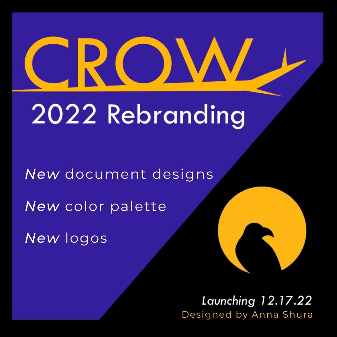
Purpose of Rebranding
Crow, the Corpus & Repository of Writing, is a web-based archive with a focus on applied linguistics and rhetoric & composition to aid research and professional development. Crow began in Fall 2015 at Purdue University and has since expanded to institutions internationally. With the increase of social media presence and Crow’s interest in rebuilding our website, rebranding is a natural step in Crow’s 2022 development.
Crow’s original branding featured a grayscale color palette and a logo design from a photograph of a real crow spotted in Sequoia National Park in June 2018. In approaching the rebranding initiative, I drew from my previous social media and design experience to create an updated branding package for Crow addressing two main goals. The first goal of the rebranding initiative is to introduce colors to the grayscale palette. A more diverse palette allows Crow to draw more attention across digital platforms and enjoy greater variety in appearance. The second goal centers around adding more graphics to the branding package. Introducing more logo and document designs increases Crow’s opportunities to be visually represented through logos and document templates. The introduction of more colors and graphics to the Crow brand identity is put into effect on the blog, Twitter, YouTube, and on the in-progress website redesign, and on documents and presentations.
Research
Summit Presentation and Feedback Considerations
After workshopping initial rebranding palettes and a new crow graphic, I began testing graphics in blog posts and on Twitter. At Crow’s 2022 Spring Summit, I presented my work to Crowbirds to gain feedback about the current design work and color palettes and to ask about rebranding materials they would be interested in seeing in the future. Researchers from Crow sites around the world offered their feedback. The results of the summit provided confidence in the direction of the redesign and offered ideas around producing presentation and document header templates to be used in Crow’s frequent publications and workshops.
Accessibility
Designing a new color palette for Crow is a foundational step in the rebranding process. Elevating the greyscale palette addresses the first rebranding goal and provides the necessary components to design new graphic elements. To enable Crow’s brand identity to appeal to a large audience, accessibility is a core value and is essential to the design process.
After initial color palettes were formed, I reviewed the Web Content Accessibility Guidelines with specific attention to color contrast recommendations and tests. Accessibility color contrast tests, such as the A11Y Color Contrast Accessibility Validator which reviews a web page design in accordance with WCAG guidelines, will be employed in Crow’s website redesign. To prepare Crow’s website to meet accessibility standards, I focused on color contrast tests when forming new palettes. Color blindness was also taken into account. Blue and yellow contrast is noted as the easiest to see, and thus, Crow’s color palette centers around blue and yellow contrast to best work towards accessibility.
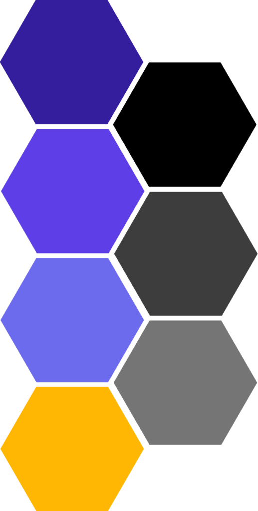
Coolors is the main platform I used to explore, build, and test color palettes. Coolors contrast test allows the designer to find the contrast ratio between two colors. The minimum contrast ratio is 4:5:1. Within a logo design, a contrast ratio does not have to be met; however, as a designer, I prioritized accessibility considerations across rebanding elements. Using Coolors’ contrast checker, I compared the ratios between colors in potential palettes to determine if the minimum contrast ratio was met. Additionally, I considered the contrast of black and white text with potential color options to prepare for future branding designs and the contrast of the crow logo. The final palette includes the following colors:
| Crow 2022 Rebrand Color Palette | |||
| Color Name | Color Description | HEX Code | Prefer Black or White Contrast |
| Blue Pantone | Darkest Purple | 351E9E | White |
| Majorelle Blue | Medium Purple | 5D3EE7 | White |
| Medium Slate Blue | Light Purple | 6C6BED | Black |
| Selective Yellow | Gold Yellow | FFB703 | Black |
| Sonic Silver | Medium Gray | 757575 | Black & White |
| Onyx | Dark Gray | 3D3D3D | White |
In the final palette, the acceptable contrast ratios between colors, not including black and white contrast, are as follows:
| Strongest Color Contrast Ratios in Crow 2022 Rebrand Color Palette | ||
| Color 1: Name: HEX Code | Color 2: Name: HEX Code | Contrast Ratio |
| Blue Pantone: 351E9E | Selective Yellow: FFB703 | 6.57 |
| Onyx: 3D3D3D | Selective Yellow: FFB703 | 6.22 |
| Majorelle Blue: 5D3EE7 | Selective Yellow: FFB703 | 3.64 |
Design
To gain inspiration for Crow’s redesign, I reviewed similar organizations, such as the Language & Cognition Journal @LangCognition, AWP @awpwriter, and Writing on the Edge @woejournal, across Twitter and utilized online tools, such as Coolors. In studying the profiles of the academic community on Twitter, I found journals and research groups most commonly utilize blue in their branding which generates a sense of security and confidence. Purple frequents academic branding as well as it traditionally embodies connotations of wisdom. Brighter color tones were most common across organization branding, and this choice relies on gaining attention on the digital platforms of social media. In establishing Crow’s new palette, bright blue and purple tones were most relevant considering the aforementioned connotations. Blue and purple also align with the physical palette of a crow bird.
To further compare possible color additions to Crow’s palette, I worked in the digital color software provided through Coolors. Coolors is an online platform with color palette generation and in-depth color tools reviewing contrast and tones within individual color swatches. I compared each potential color for Crow’s palette through the three following options: shades, tints, and tones. Each option adds to the base color: black is added in color shades, white is added in color tints, and gray is added in color tones. Brighter shades of colors generate a more positive connotation with a brand with their uplifting tones.
After establishing bright purple and blue base tones, I worked across the color wheel to introduce contrasting yellow tones. The classic positive connotation of a bright yellow or gold tone is an appealing addition to the brand. To immediately incorporate the yellow contrast into the Crow brand, a yellow branch was added to the redrawn crow bird logo.
The chosen palette follows the traditional cool and bright academic tones and aligns with the coloration of a crow. Importantly, the addition of purple and yellow to the original grayscale branding diversifies Crow’s branding for all its feature uses.
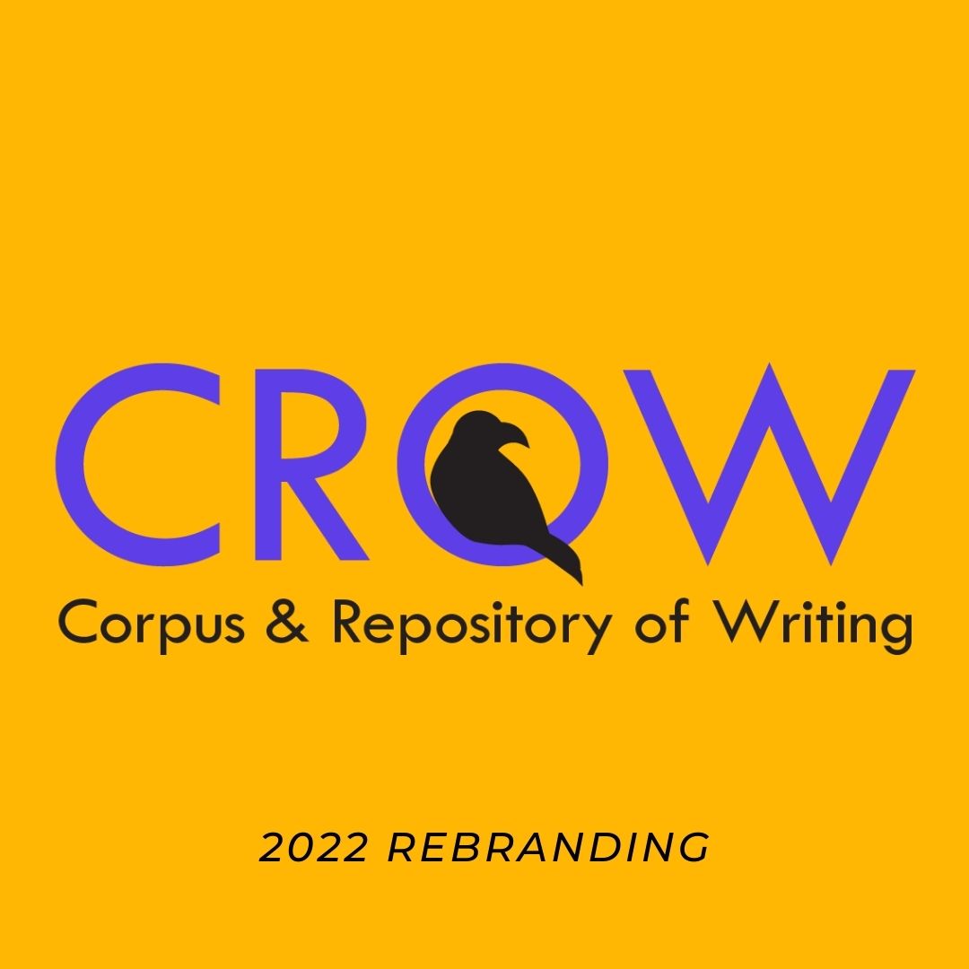
Logo
Crow’s logos were originally drawn from the image of the crow in Sequoia National Park. Over the years, Crow designed a shield logo featuring just the crow head, a secondary shield logo with the addition of text inside the head, a banner logo, and a full body logo with lettering inside the crowbird. The 2018 full body logo with “Crow” embedded into the design served as the base for the rebranded logo. Emily Jones, a Purdue Crow researcher responsible for original designs, designed the full body logo. However, with the creation of several logos at the time, the full body crow was never employed in Crow’s branding.
I worked to redraw the full body crow and combine elements with the updated head design of the shield logo through Adobe Photoshop and Illustrator. To create a less detailed graphic which could be easily employed across documents and platforms, the full body crow with text was redrawn to be a sitting crow without text. The new sitting crow bird refers to the modern design of the crow shield for the head shape while enabling design diversity between the crow shield profile picture and a banner on Twitter and YouTube.
Final Products
The final products of the 2022 Crow Rebranding Package include, the sitting crow logo, a color palette, social media header, several sticker designs, and presentation and header templates. The main programs used to build the elements of the package are Adobe Indesign, Adobe Illustrator, Adobe Photoshop, Coolors, and Canva.
Logo
A crow bird sitting on a gold branch is the primary logo in the 2022 Crow Rebranding

Color Palette
Crow’s palette features purple tones and yellow gold alongside its original grays.
| Crow 2022 Rebrand Color Palette | ||
| Color Name | Color Description | HEX Code |
| Blue Pantone | Darkest Purple | 351E9E |
| Majorelle Blue | Medium Purple | 5D3EE7 |
| Medium Slate Blue | Light Purple | 6C6BED |
| Selective Yellow | Gold Yellow | FFB703 |
| Sonic Silver | Medium Gray | 757575 |
| Onyx | Dark Gray | 3D3D3D |
Social Media Header
Crow’s profile picture on social media platforms is the black and white shield logo. To provide graphic contrast, Crow’s social media header draws attention to the new sitting crow logo and color palette.

Sticker Designs
The goal of Crow’s stickers is to promote the organization and connect team members. Four sticker designs have been added to Crow’s collection through the 2022 branding package.
Badge Sticker
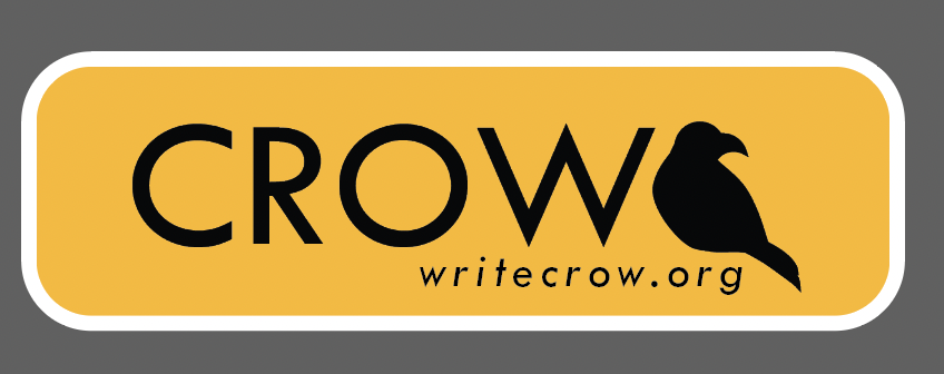
The badge sticker highlights the text based 2022 rebranding logo. This logo is also featured on Crow’s new letterhead templates.
Gold Sticker
The gold sticker relies on a simple graphic with the new sitting crow logo and the bright color addition to the Crow palette. The addition of Crow’s website, writecrow.org, allows the gold sticker to act as a digital publicity resource.
Branch Sticker
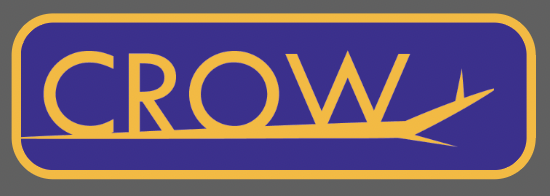
The branch sticker also connects to a new letterhead template design. By playing with the sitting crow logo’s branch, a modern logo featuring a crow through text is created.
Circle Sticker
The circle sticker frames Crow’s namesake as the sitting crow bird peers out from the bold yellow background.

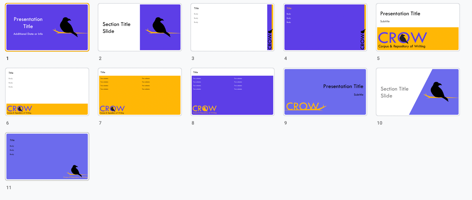
Presentation Templates
Triangle Motif
These slides offer a strong graphic background to presentations with their image centered crow logos and diagonal borders. Transparent and bold color options are available.
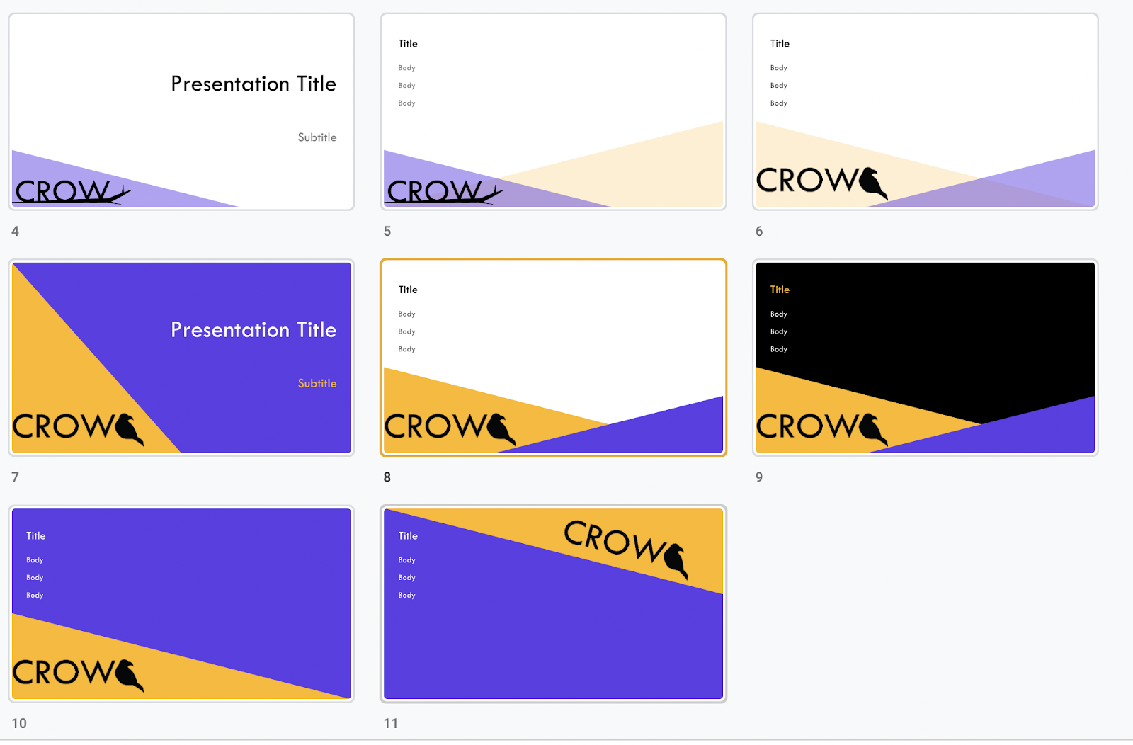
Bird Motif
These slides provide a close-up on the crow bird itself through three logo designs: the crow bird on a branch, the crow bird inside the text, and the crow text on a branch. Once again, color choices vary between backgrounds of Majorelle Blue (medium purple) , Medium Slate Blue (light purple), and Selective Yellow (gold yellow).
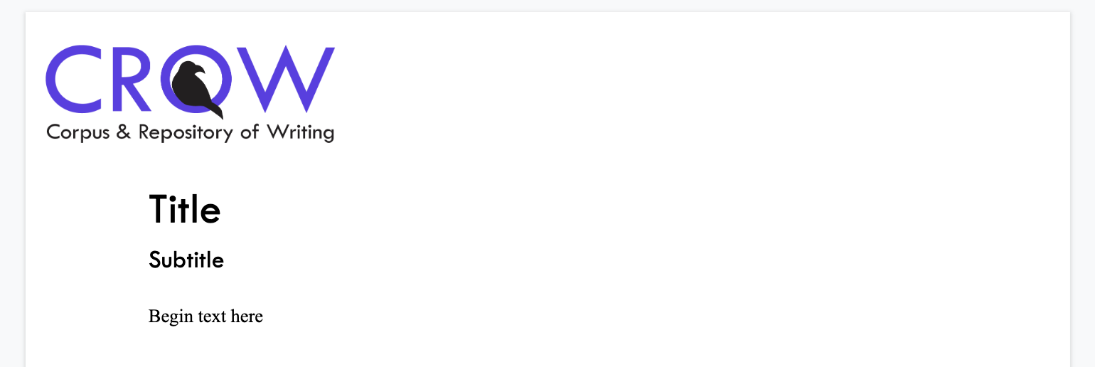
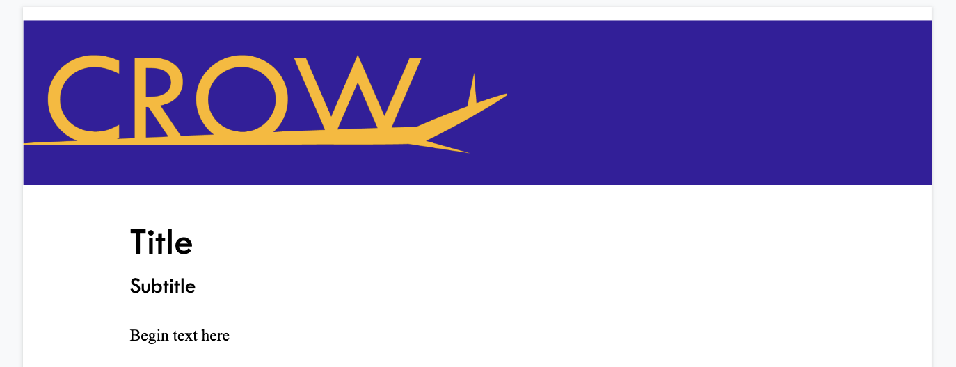
Letterhead Templates
Text Based Logo Letterhead
The first 2022 branding letterhead template features the text based crow logo and new medium purple color palette addition. With the simplistic text logo and allusion to the sitting crow bird, the text based logo letterhead is a minimalist option.
Branch Logo Letterhead
The branch logo letterhead is a bolder option than the text based logo letterhead with its dark purple background and sharp graphic.
Social Media Graphic Designs
The following videos were made by combining Adobe Creative Suite designs in Canva. The advertisements serve as examples of how Crow’s 2022 rebranding will be implemented in future graphic design work.
Conclusion
Ultimately, the 2022 rebranding initiative for Crow worked to address two main goals: to design a new color palette and graphic designs. These goals were addressed after a process of accessibility research, color contrast tests, feedback from within the Crow community, and design iteration. The key results of the rebranding process is a new color palette with purple and yellow and the new sitting crow logo featured throughout numerous additional document designs and graphics. All Adobe Illustrator files for the new crow logo, graphics, and document designs are accessible to allow the logo to be utilized in future social media and blog posts. Additionally, the hex codes for the new color palette have been documented for all subsequent design posts and the website redesign. 2022 rebranding elements are already at work in Crow’s online identity on Twitter and the blog. In Crow’s upcoming website redesign, the 2022 branding package will be a guiding factor to establish an updated identity for the Corpus & Repository of Writing.
3 responses to “Crow 2022 Rebranding Report”
[…] McMullin debuted Crowbird Anna Shura’s newly designed slide deck template for her presentation. Anna’s designs really brighten up how we present Crow […]
[…] of collaboration. Now the interface bursts with a vibrant new color palette created in 2022 by Anna Shura, a polished layout design, and plenty of engaging images that amplify our writing (i.e. all the […]
[…] Shura, who rebranded Crow and the website in 2022 to its current beautiful and accessible color […]